
Pool mosaic design splits into two camps: the quiet kind that just makes the water look good, and the loud kind that turns the floor into a picture. Both are valid, and the mistake we see most is mixing the two without a plan, so a pool ends up busy instead of bold. Here’s how we think about pattern, gradient and custom art when a client asks what will actually hold up underwater.
Start with the band
A single waterline band is the entry point into pool design, and it’s where most pools should start. One tonal course in a mid blue hides the water mark and looks finished. From there, a second contrasting course, or a thin accent line in white or a brighter blue, adds a crafted note without committing the whole pool to a motif. The band is the safe place to be brave, because it’s a small area and it reads as a choice rather than a risk.
Gradients that work
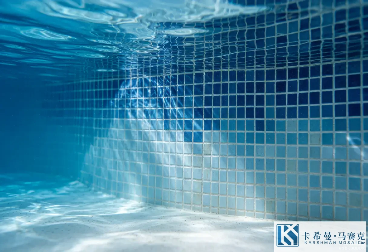
A gradient, a wall or floor that steps from deep navy at the bottom to pale sky at the top, is a favorite for a reason: it makes the water look deeper and clearer, and it does it with color alone, no picture needed. The catch is in the sheets. A gradient needs careful grading so the shade steps read even, not patchy, and a weak batch can show a seam where two runs meet. We suggest approving a laid sample that includes the full gradient before the order, because the installed read is the thing you’ll see every swim, not the chip in your hand.
Geometric patterns
Simple geometry, a running bond, a checker, a band of chevron at the waterline, reads clean and stays calm under moving water. Geometry is forgiving because the repeat hides small sheet misalignments, which matters in a pool where the surface is large and the eye scans it constantly. A checker in two blues is a common pick for a classic look; a single chevron band adds motion without overwhelming the floor. Keep the geometry to two or three tones so it reads as pattern, not noise.
Custom floor art
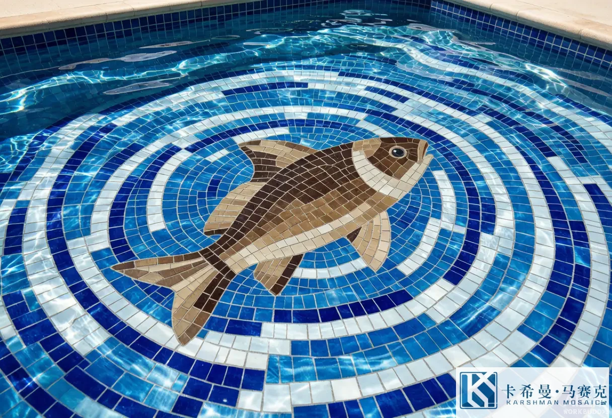
This is the loud camp, a fish, a wave, a star, a family crest set into the floor where you see it from the patio or the diving board. Done well, it’s the thing guests photograph. Done poorly, it’s a muddy blob once the water ripples over it. The rules we follow: keep the motif large and simple, limit the palette so the shape stays legible, and place it where the water is shallow and still, not under the return jet where it’ll shimmer into confusion. A floor motif should read as a surprise from the patio, not a busy pattern up close.
What reads well underwater
Water and light do specific things to a design. Fine detail blurs; a thin line that looks sharp dry can vanish under a foot of moving water. High contrast, dark on light or light on dark, holds up better than two close blues that merge once submerged. A motif with a clear silhouette beats one with internal detail every time. We steer clients away from photo-real art on a pool floor for this reason; what looks rich on a sample often reads muddy installed, and a muddy motif is harder to live with than no motif at all.
Mixing with the deck and the planting
The pool doesn’t sit alone; it sits in a yard. A geometric pool in two blues pairs well with clean stone decking and a modern planting. A soft gradient suits a Tropical setup with palms and a wooden deck. A custom art floor wants a calm deck so the art is the star, not a third pattern in a busy scene. The common error is overmatching: pool, deck and planting all busy at once, so nothing reads. Pick one hero and let the rest support it; in most backyards, that hero is the water or the art, not both fighting for attention.
A gradient pool that worked
A client wanted a small city pool to feel like a resort without a single motif. We set the floor in a gradient from deep navy at the drain to pale sky at the shallow end, with a single white waterline, and left the deck in pale stone. From the lounge chairs the water looked twice as deep as it was, and the gradient did all the work a picture would have, without the risk of a muddy floor. No fish, no crest, just color stepping the right way. That’s the case for letting a gradient carry the design when the brief is “calm but not plain.”
Mistakes worth avoiding
A few recur. People pick a fine-line pattern and lose it underwater. They order a gradient from two batches and get a seam. They put a detailed motif under the jet and watch it shimmer into mush. They mix three patterns and crowd the surface. None are hard to avoid; they need the design approved as a laid sample, not loose chips, and a tiler who has set patterned pool mosaic before, not just plain walls.
Getting the install right
Pattern and gradient need alignment, and alignment needs a steady hand. The sheets have to line up so a gradient steps evenly and a motif sits centered, which means the substrate has to be true and the tiler has to work to a reference line, not by eye. Ask to see a finished patterned pool, and check the waterline corners and the motif edges, where weak work shows first. A good pool installer will talk about the whole build, the waterproofing, the joints, the grading, not just the tile.
Ordering a design
Approve a laid sample under daylight, not just a chip, and note the grout, the sheet size and the backing. For a gradient or a motif, ask for a sample that includes the full run so you see the seams before they’re in your pool. Order a little extra so a later repair matches the batch; a patch from a different run can shade off and show as a line. Keep the sample as your reference through the build, and the design will read as intended rather than as a guess.
What the tile is made of
Pool mosaic is small glass pieces, typically 10 to 25 millimeters, mounted on a mesh or paper sheet so a wall or floor can be set in panels. The color runs through the body, so it doesn’t wear off under scrubbing or fade under sun the way a surface-printed tile can. Hold a sample to the light; the hue should look even, not patchy, and patchy color usually means weak grading at the plant. That’s a useful thing to know before you buy a motif by the carton, because a motif shows every shade gap.
When to keep it simple
Simple is often the right call. If the pool is small, a single band beats a floor motif that crowds it. If the budget is tight, tile the waterline and leave the floor plain. If you’re not sure you’ll love a crest in five years, a gradient gives the drama without the commitment. Custom art is a tool for a specific brief, not a default, and a pool that whispers often ages better than one that shouts.
Bringing a motif to life with a designer
A custom floor motif is easier with a drawing than with a wish. Sketch the shape at the size it will sit, in the two or three tones you mean to use, and show it to the tiler before the order. A good installer will tell you which lines will hold up underwater and which will blur, and that early talk saves a motif that reads wrong once the water moves. Keep the drawing simple; a clear silhouette in two tones beats a detailed scene that turns to mush under a foot of rippling water. The motif is a surprise from the patio, not a fine print to study up close.
Color blocking versus all-over pattern
Two approaches suit most backyards. Color blocking uses a few large fields of different blues, say a deep floor and a pale wall, for a calm, modern read that’s hard to get wrong. An all-over pattern, a checker or a wave across the whole floor, adds energy but shows every sheet misalignment, so it needs a truer wall and a steadier hand. We lean clients toward blocking when the pool is small or the brief is calm, and toward pattern when the space is large and the owner wants motion. Either can look right; the miss comes from mixing the two without deciding which one leads.
Design tips for a small pool
A small pool rewards restraint. A single waterline band and a pale floor will make the water look bigger than a busy motif that crowds a compact surface. If you want a picture, place it in the shallow end where it’s seen flat from the patio, not under the steps where it tilts and shimmers. Keep the palette to two blues and a white; a third tone is the usual point where a small pool starts to feel busy. The aim is a surface that reads as one calm thing, because a small pool shows every extra line.
What custom art costs
Custom art costs more than a plain band, and the spend rises with the detail. A simple two-tone shape is a modest step up from a standard field; a multi-color scene with curves needs more sheets, more cutting and more set time, so the labor climbs with it. You can keep it contained by limiting the motif to one panel and leaving the rest of the floor in a single color, which delivers the art without wrapping the whole pool in custom work. For a backyard that wants a signature without a full custom build, one well-placed motif is usually the smarter spend than an all-over pattern.
If you want to compare pattern and gradient ranges and see how a motif might read through water, contact our team for sample boards and current lead times.