
Color is the first thing anyone notices in a mosaic, and it is also the hardest part to get right after the fact. A tile color that looks good on a screen can shift once it sits on a wall under real light.
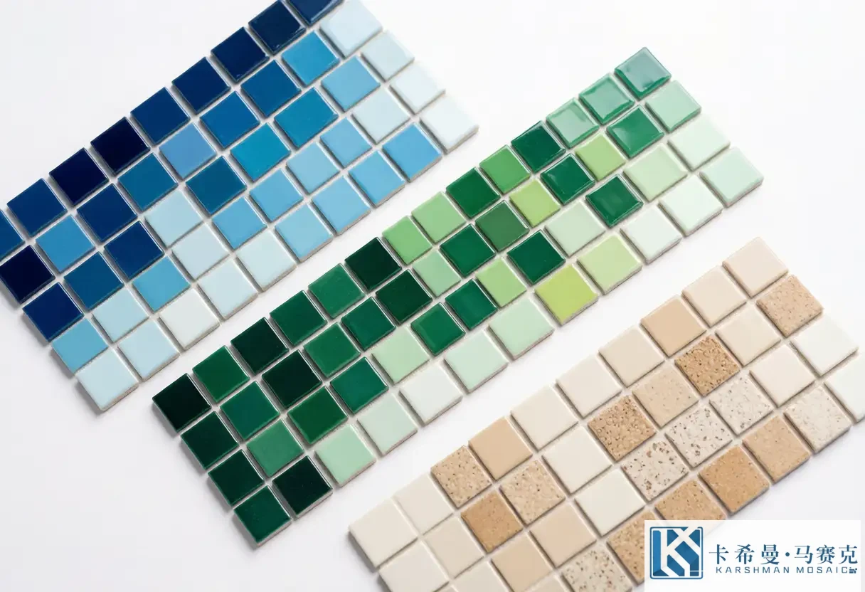
Planning the palette before ordering saves rework and keeps the finished piece coherent. This guide walks through how to build a mosaic color palette that flows.
The good news is that mosaic is forgiving: small chips let you mix many tones in one surface, so a palette can be rich without looking busy. The trick is choosing tones that relate to each other rather than fighting.
Start From One Anchor Color
Begin with a single color you are sure about—often drawn from a countertop, a fabric, or the room’s fixed elements. This anchor becomes the reference that every other tone is checked against. Once the anchor is fixed, add lighter and darker versions of the same hue to build depth.
An anchor also keeps a custom project focused. When a client brings five favorite colors, picking one as the base and treating the rest as accents usually produces a calmer, more finished result.
Blending Tones vs Hard Contrast
A blended palette uses neighboring tones—several blues, or a blue-to-green shift—so the surface reads as a soft field with gentle movement. This suits large walls and calm rooms. A contrasting palette places two or more distinct colors next to each other for a sharper, more graphic look, which suits feature walls and logos.
very successful projects mix the two: a blended base with one or two contrast accents. The accents give the eye a place to land, while the blend keeps the whole surface from feeling fragmented.
Light, Sheen and Color Shift
Glass mosaic reflects light, so a color can look brighter on a lit wall than on a sample board. Matte ceramic absorbs more light and reads softer. Glossy and matte chips of the same color can look like two different shades side by side, so decide the finish early.
Color also shifts with the time of day. A mosaic that looks cool in morning light may warm up under evening lamps. View samples at the times you actually use the room.
Sample in Real Light
a reliable step is to tape physical sample chips on the actual wall and live with them for a day.
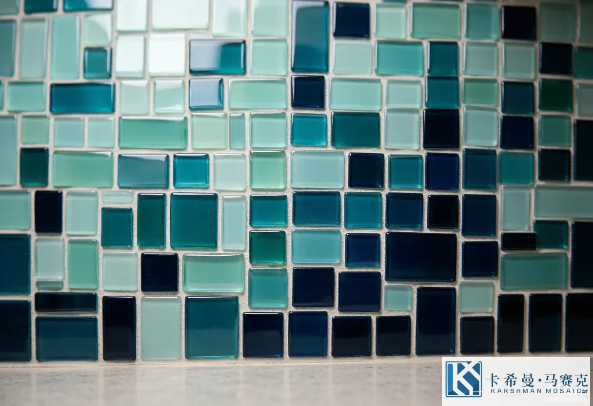
Screen previews are useful for layout, but they cannot show how glass reflects or how two tones sit a meter apart. A few sample boards cost little and prevent expensive mistakes.
For custom work, ask the maker for a real chip board in the chosen colors, shipped to the site. View it in daylight and under the room’s own lighting before production starts.
Matching Palette to Room Mood
Cool palettes—blues, greens, blue-greys—read calm and open up a small space. Warm palettes—sand, terracotta, amber—feel grounding and cozy. A neutral base with a single color accent is the safest long-term choice, because it ages well and adapts if you change cabinets or decor.
Think about the feeling you want before the specific colors. “Calm and bright” leads to a different palette than “warm and grounded,” even within the same room type.
Using Neutrals as a Bridge
When a palette risks looking choppy, a neutral tone—white, cream, soft grey—acts as breathing room between stronger colors. Neutrals also let a feature color stand out without competing with a second bold tone. In a busy room, more neutral chips usually read as more intentional.
Working With a Maker on Custom Color
For a custom mosaic, the palette is part of the design brief. Share the anchor color, the mood, and any “avoid” colors, then review a physical sample before production. A maker who samples in real light and shows you the blend on a board is doing the work that keeps the final piece consistent.
A mosaic color palette is a small decision with a large effect. Anchor on one color, blend with care, sample in the room, and let neutrals do the quiet work. For help building a palette for your project, visit our contact page to talk with our team.