
Color and finish decide how glass mosaic reads in a room, often more than the pattern does. Glass carries color differently from ceramic or stone, and its surface can be glossy, matte, iridescent or textured, each with a distinct effect. This guide walks the color families, the finish types, the pattern basics and the way lighting changes the whole picture.
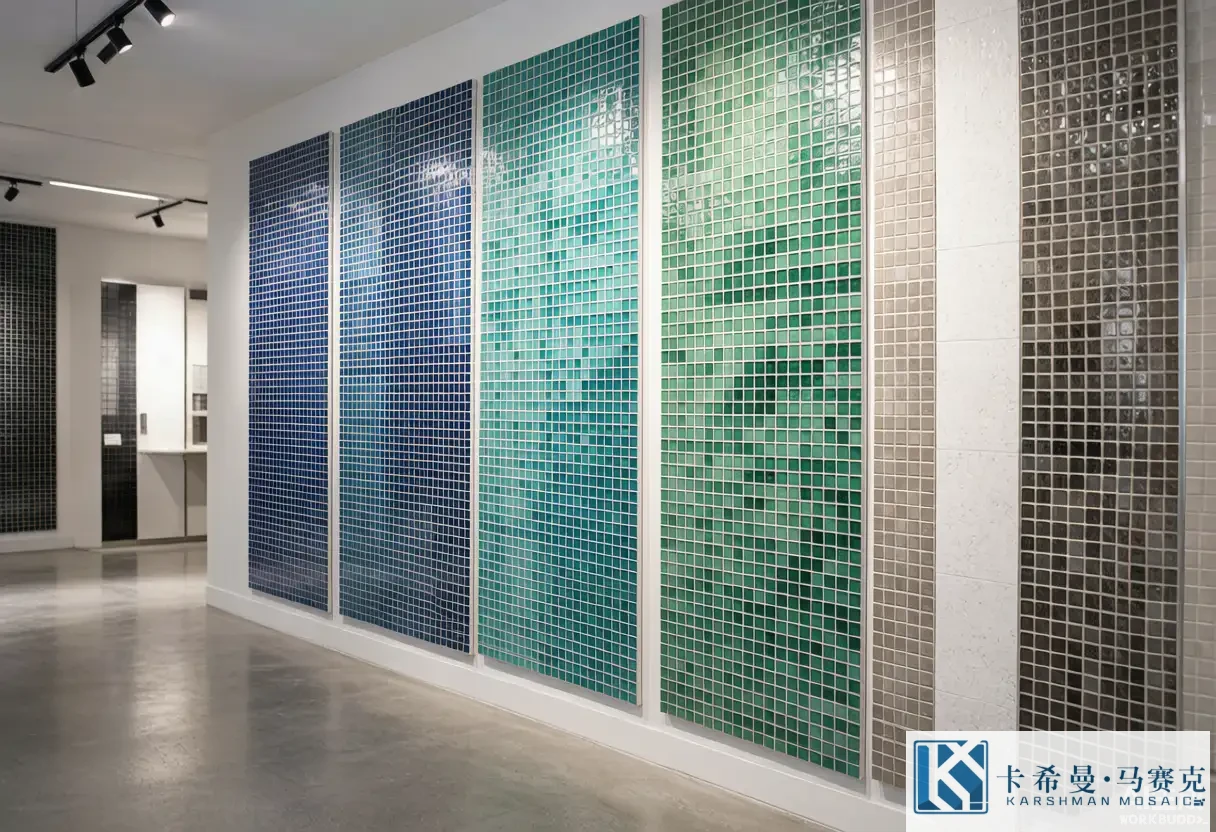
The color families
Glass mosaic spans a wide range. Blues and teals are the common choice for water and calm interiors; greens bring a garden or spa feel; neutrals – white, grey, sand, beige – pair with most rooms and read as quiet; warm tones like amber and bronze add a glow; black and white give a crisp, graphic look; and mixed sheets blend two or more families for movement. Starting from the family narrows the search faster than browsing every sample on a wall.
How glass carries color
Unlike a painted surface, glass holds color through its body, so the hue has depth and shifts with the angle of view. Translucent glass lets some light pass and reads brighter; opaque glass shows a solid face; iridescent glass adds a thin coating that shifts between two tones as you move. This depth is why a blue glass mosaic looks richer than a flat blue paint, and it is also why the same tile can read differently across a day as the light moves.
Finishes: glossy
Glossy glass is the familiar face of mosaic. It reflects light, brightens a space and reads as clean and modern. Glossy surfaces suit backsplashes, feature walls and pool interiors where the shine is part of the brief. The trade-off is that a glossy face shows marks and water spots, so it needs prompt wiping in a kitchen or bath. For many interiors, glossy is the natural pick when a surface should lift the light in a room.
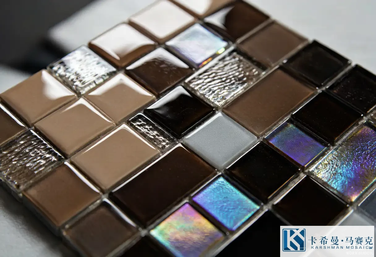
Finishes: matte and frosted
Matte glass softens the look and reduces glare, which suits spaces with strong sun or a calm scheme. Frosted glass sits between matte and glossy, with a gentle diffusion that hides minor marks while keeping some glow. Both finishes are easier to keep clear than high gloss in a busy area, and they pair well with stone or porcelain where the goal is texture rather than shine. Choosing matte over gloss is often a comfort decision as much as a style one.
Finishes: iridescent and textured
Iridescent glass carries a thin coating that shifts color with the angle, adding life to a feature wall or a spa. Textured glass has a raised or uneven face that catches shadow and gives grip, which helps on wet floors and steps. Both finishes suit smaller doses or accents rather than a full wall unless the brief calls for a bold statement, because their effect is strong and can overwhelm a large, plain wall if used everywhere.
Mixing finishes in one design
Combining finishes adds depth that a single surface cannot. A glossy field with a matte border, or a plain wall with an iridescent band, gives contrast without introducing a second color. The key is restraint: pick one finish as the base and let the other play a supporting role. A short sketch of where each finish lands keeps the mix intentional rather than busy once the sheets are on the wall.
Neutrals and how they read
Neutral glass mosaic is a safe base for most schemes because it pairs with wood, stone, metal and strong color alike. White and sand read bright and open; grey reads calm and modern; beige reads warm. Neutrals also hide the slight shade variation between batches better than a deep, saturated tone, which makes them a sound choice for a large area where consistency matters more than drama.
Bold color and how to use it
A strong color – deep blue, emerald, amber – brings energy but asks for care. Used across a whole wall it becomes the room’s main voice; used as a band, a niche or a backsplash, it adds character without dominating. A useful approach is to let a bold tile carry a small, high-impact zone and keep the field neutral, so the color reads as a decision rather than a risk. Sampling the tone under your own light prevents a shade that feels louder than planned.
Pattern basics
Patterns start simple. A straight grid is clean and timeless; a brick layout shifts the joints for a calmer read; a random mix of two shades breaks the grid without a formal pattern; a gradient moves from light to dark across the area; an ombre blends families for a soft flow. The pattern should follow the room’s scale – fine patterns suit small areas, broader ones suit large walls – so the design stays readable at the distance people actually view it.
Combining with other materials
Glass mosaic pairs well with other finishes. A glass band over a porcelain field gives a decorative edge to a working surface. Glass with natural stone adds a crafted contrast of shine and texture. Metal accents beside glass bring a cool highlight. The mix works because glass is thin and its color is strong, so it can sit next to a plainer material without fighting it. Letting one material lead keeps the combination balanced.
Scale and pitch effect
The size of the tesserae changes the read. Fine pieces give a detailed, refined surface but more grout lines; larger pieces read cleaner and set faster. Pitch – the spacing – affects how busy the wall looks and how much grout shows. For a small niche, finer tile looks right; for a large wall, slightly larger pieces keep the pattern calm. Checking a sheet flat shows how the spacing will look once grouted, which is hard to judge from a screen.
Lighting interaction
Light is part of the design with glass. Natural daylight brings out the depth and shifts the hue through the day; warm artificial light adds glow; cool light keeps it crisp; underwater light in a pool turns the color into a glow. Planning the light source before the tile is fixed helps you pick a finish that responds well – glossy for sparkle, matte for calm, iridescent for movement. A tile that looks flat under one light can come alive under another.
Sample and sign-off
Before a volume order, approve a physical sample under your lighting and note the finish, the grout color and the sheet size. For a mixed or custom design, approve a laid sample, not just loose pieces, because the joint color and the spacing change the final read. This sign-off is the cheapest point to adjust, and it gives both sides a reference if a question arises later. Treating the sample as the contract settles many disputes before they reach the site.
Design ideas by room
In a kitchen, a glossy glass backsplash in a calm tone brightens the work area. In a bath, a matte or textured shower floor adds grip while a glossy wall adds light. In a pool, a blue interior with a contrasting waterline frames the water. In a living space, a feature wall in iridescent or mixed glass becomes the room’s focus. Matching the idea to the room keeps the color and finish serving the space rather than overwhelming it.
Sample board workflow
A sample board turns loose ideas into a decision. Lay the chosen tile next to the grout, the adjacent material and a swatch of the room’s other finishes, then view it under the light the space actually has. A board shows the joint color, the spacing and the way the glass meets stone or paint – details a screen cannot. Building the board before the order is the cheapest point to adjust, and it gives the tiler a clear reference on the day of the job.
Combining glass with porcelain in one wall
A common and effective mix is glass mosaic over a porcelain field. The porcelain carries the working, wipeable surface; the glass adds a decorative band, a niche or a full feature. Because glass is thin, it sits flush against porcelain without a step, and its color draws the eye to the intended zone. The trick is to let one material lead and the other support, so the wall reads as one scheme rather than two finishes competing for attention.
Trends versus timeless choices
Color trends move, but glass mosaic has a stable core of blues, neutrals and simple patterns that stay current across years. A safe approach is to build the field from a calm, lasting tone and express trend through a small, changeable accent – a band or a niche – that is cheap to refresh. This way the main surface does not date quickly, and the room can shift mood with a minor update rather than a full re-tile. Matching the level of trend to the zone keeps the design flexible.
Budgeting for a glass mosaic feature
Budget follows the zone. A full wall in handmade or iridescent glass costs more than a neutral field with a single accent, so set the spend where the eye lands first and keep the rest simple. Order with a waste allowance and from one batch so shade stays matched, and confirm lead time before the schedule is fixed. A clear quantity also helps a supplier quote a realistic price, and it avoids a shortfall that forces a second, mismatched order mid-project.
Glass mosaic for small spaces
In a small room, glass mosaic can make the space feel larger and brighter. A light, glossy tile reflects what little light there is and reduces visual weight on a wall; a continuous color across a backsplash or shower avoids the busy seams that break up a tight area. Using one family rather than several keeps the eye calm, and a single feature – a niche or a band – adds interest without clutter. For a compact bath or kitchen, letting glass do the brightening is a practical route to a room that reads open, and it avoids the heavy feel that dark, large tile can bring to a confined space.
Glass mosaic offers a broad set of colors and finishes, and the right pick comes from the room outward, with lighting and pattern following. If you want to compare finishes in person, contact our team for sample boards and current lead times.