
European pool mosaic color is what turns a blue box into a place that feels like a Mediterranean courtyard or a French garden. The European range is built on a classic base of blue and white, then extended with the earth tones of the region – terracotta, slate, cream and sand. Used with care, these colors give a pool a calm, ordered, old-world character; used without a plan, they can feel flat or mismatched. The trick is to treat European color as a heritage palette with a few accents, not a wide spread across the floor. This guide covers the European color range and how to combine it for a calm classical feel or a warmer rustic one that suits your pool, your light and your setting.
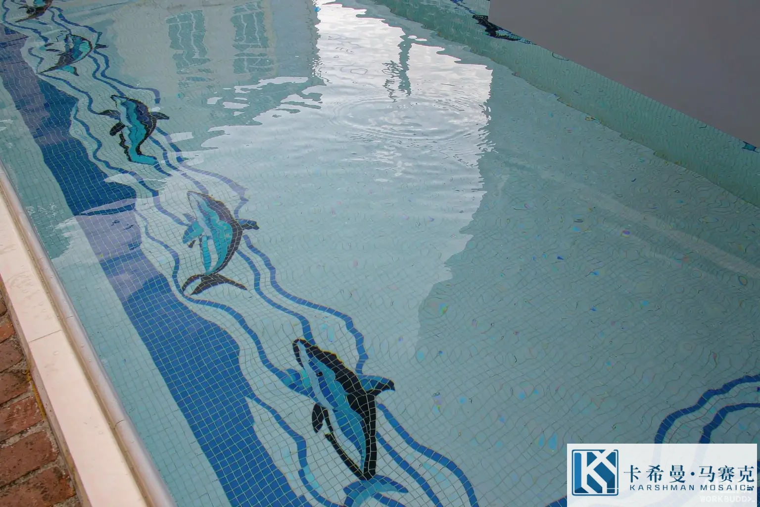
The European color family
European pool color lives in a restrained, heritage range built around the Mediterranean. The base is the blue-and-white pairing that reads as classical from Greece to France – a clean blue field with white ornament, or a white field with blue lines. On top of that base sit the warm earth accents – terracotta, a soft brick red – and the cool stone tones – slate grey, cream and sand – that suggest architecture and terrace. The family works because the tones are related through European building tradition, so they sit together without fighting. The discipline is to keep blue and white as the field and spend the earth tones as accents, so the pool reads classical rather than mixed.
Mediterranean blue and white
Mediterranean blue and white are the starting point of a European palette. A clear pool blue reads classic and clean; a deeper navy reads formal and villa-like; a soft white or ivory reads bright and courtyard-like. These tones form the calm ground that most European pools use, letting the white meander or the blue laurel do the talking. A single blue field with a white border already feels European without any figurative motif. The safe plan is to build the whole pool on one or two blue tones with a white accent, then introduce the richer earth colors at the border and the feature where they show against the calm ground.
Terracotta and warm earth tones
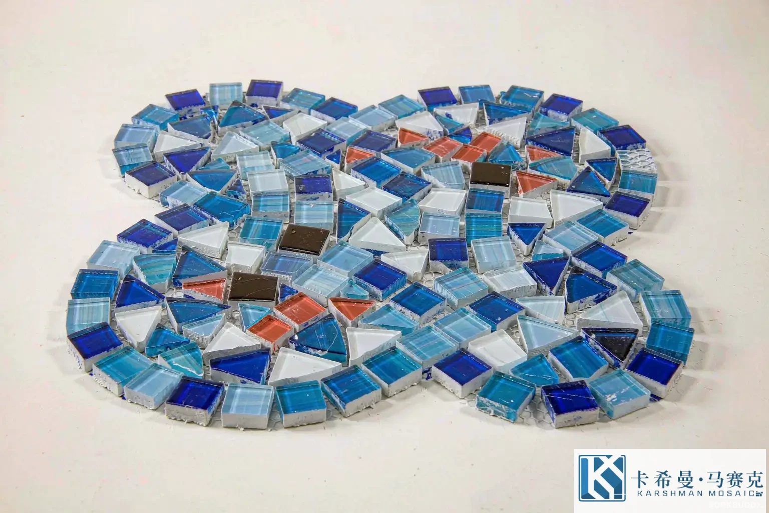
Terracotta is the signature warm accent of European pools. A terracotta tone – a soft brick red – reads sunny and pairs naturally with blue and white, the way a tiled terrace sits against a blue sky. Terracotta works as a border accent, a small field step near a spa, or a motif color in a sun-themed feature. Used sparingly, it warms a calm pool; used across a large area, it can feel heavy against the water. The habit is to treat terracotta as the spark, not the base: a terracotta line at the waterline, a terracotta flower in a medallion – placed against the cool field so the warmth reads as a highlight rather than a wash. A touch of terracotta is what often tips a blue-and-white pool from generic to Mediterranean.
Slate grey and cool stone tones
Slate grey and cool stone tones carry the architectural side of the European range. Slate reads refined and pairs with a white or pale field for a formal, almost French look. Stone grey suits borders and steps where the pool meets the terrace, tying the water to the surrounding pavement. Because grey is a quiet color, it supports rather than competes, which is useful in a scheme that already carries blue and terracotta. A slate border on a blue field, or a grey step band, reads composed and helps the pool feel built into the architecture rather than floating in it. Grey is the tone that keeps a warm palette from running hot.
Cream, sand and ivory
Cream, sand and ivory are the soft neutrals of the European palette. A warm cream reads like sunlit stone; a pale sand reads like a courtyard floor; an ivory reads bright and clean. These tones suit fields that want a lighter, airier feel than a full blue, and they make a good ground for blue or terracotta motifs because the contrast stays gentle. A cream field with a blue meander and a terracotta accent reads Mediterranean courtyard rather than classic pool. The caution is depth: a pale neutral field can look shallow and warm, so it suits shallow ledges and spas more than a deep main pool, where a blue keeps the water feeling cool and deep.
Combining European colors
Combining European colors is about balance between the cool base and the warm accent. A common, balanced plan is a blue or white field, a terracotta or slate border, and a feature that pulls two or three of the accents together. The warm tones should stay a minority of the surface so the cool base keeps the pool calm. A pool with terracotta, slate, sand and blue all across the floor tends to read mixed rather than European, so restraint in the warm range is the habit that keeps the scheme composed. The eye should land on one or two warm moments, not be pulled in several directions at once by a spread of earth tones.
Using color to set the mood
European color sets the mood by how much warm tone you allow. A calm classical pool stays mostly blue and white with a small slate or terracotta accent – formal and composed. A rustic Mediterranean pool adds more terracotta, sand and a touch of cream, reading warm and courtyard-like. The same motifs read differently against a calm versus a warm ground, so the color plan should come before the motif plan. A good brief names the mood first, then the palette, then the subjects, because the color is what the eye meets first when someone looks into the water, and a European pool lives or dies on that first read.
European borders and fields
The field and border are where European color does its quiet work. A field that steps from blue to a deeper navy toward the deep end already feels classical without a single motif. A border in white, terracotta or slate frames the water and ties the scheme to the terrace. A popular, balanced route is a blue field with a white meander border and a terracotta line at the waterline. The contrast lands on the frame, the field stays calm, and the pool reads composed from a distance and detailed up close. Treating the border as the main color moment keeps the spend focused and the look clean, which suits the ordered European style.
Depth and European color
Depth changes how European color reads. Submersion cools and darkens a tone, so a terracotta that looks bright dry will read a step deeper once filled, and a navy will read richer. A pale cream field makes shallow water feel airy; a deeper blue field makes the pool feel cooler and larger. Because the shift is predictable, the plan should allow for it: choose values that hold their place at the actual depth, and keep a warm accent contrast strong enough to survive the cooling. The aim is a floor that stays visible and a palette that reads as intended from the deck, not a color that looked right dry and flattened underwater. Blue and white handle the shift better than pale neutrals, which is why they remain the base.
Finish and light
Finish changes European color after build. Glossy glass reflects sun and brightens a shaded pool but can glare in direct light, which can wash out a pale cream. Matte glass keeps the tone soft and hides marks, good for a bright, open courtyard. Iridescent glass shifts color with the angle, adding life to a blue or a terracotta accent. A pool in full sun may suit a calmer finish so the warm tones stay true; a pool in shade may suit a glossy one to lift the light. The finish is a color decision as much as a shine decision, so it belongs in the plan alongside the tones rather than as an afterthought, and it is worth sampling each finish on the grid because the same tone can read different in gloss versus matte once the water is in.
Trends in European palettes
Current European pool trends lean clean and a little warm. Blue-and-white fields with a white meander border appear often in villa and courtyard pools. Terracotta and slate accents at the waterline and the steps are also common, paired with a calm field so the warm tone stays a highlight. What stays useful is the principle, not the fashion: a cool base, a shared warm accent, and a calm field. Trends come and go, but a European palette built on balance reads well in any year, and following the light and the architecture of your own pool is what makes it work rather than following a catalog blindly.
Planning a European palette
A practical European palette plan runs in order. Pick a cool base – blue, white or a step between them. Add one terracotta and one slate or cream accent, keeping the warm tones a minority. Decide where the warm tones sit – border, feature, a shallow step. Match the finish to your light. Approve a laid sample of the field, the border and the feature together, viewed in water or under the pool light, before the volume order. A list this short covers the points that decide whether the pool reads classical and calm or muddy and mixed once it is full.
Sampling before you commit
Because water and light change the read, a dry loose tile is not a safe reference for European color. Lay a sample board of the field, the border and the feature with the planned grout, and view it in water or under the pool light if you can. Check that the cool base stays calm, the warm accent pops without clashing, and the step reads at depth. This sign-off is the cheapest point to adjust a tone, and it gives both sides a reference if a question arises during the install. Treating the sample as the contract settles most disputes before the tile reaches the site, and it protects the European feel you planned.
Blue and white through tradition
The blue-and-white pairing is not a random choice – it runs through European design from Greek amphoras to French and Italian tilework, which is why it reads as heritage rather than fashion. A pool that uses blue and white taps into that long line, so it feels settled and appropriate in a villa or a courtyard without needing a literal picture. The white carries the ornament – a meander, a laurel – while the blue carries the water, a split that has worked for centuries because it is simple to read and easy to build. Knowing the tradition helps an owner trust the palette rather than chase a trend, and it gives the designer a proven base to build the accents on top of.
Pairing the palette with stone and planting
A European palette reads strongest when the pool color agrees with its surroundings. A blue field sits well against warm travertine or pale stone on the terrace; a terracotta accent echoes the same stone and the planted beds nearby; a slate border links to a grey pavement or a shaded loggia. The pool should feel attached to the architecture and the garden, not dropped into them. A simple check is to lay the sample board next to a piece of the actual deck stone and a leaf from the planting, and confirm the tones relate. When the pool color, the stone and the greenery share a family, the whole space reads composed from the first glance, which is the quiet goal of a European scheme.
European pool mosaic color spans Mediterranean blue and white with terracotta, slate and cream accents, combined so a cool base carries a few warm tones for a calm or rustic classical feel. If you want to plan a European palette for your pool, contact our team for sample boards and a layout drawing.