
Custom abstract mosaic art takes an original composition – not a photo, not a logo, but a design built from form and color – and sets it in glass on the pool floor or wall. Where a custom creature or a brand mark depicts something, abstract art expresses a feeling through balance, tone and shape. For owners who want a one-of-a-kind pool without a literal subject, an original abstract piece is a strong choice: it reads clearly underwater, it does not date, and it becomes part of the place rather than a generic add-on. This guide explains how a custom abstract commission moves from concept to grid, how the composition is balanced for the water, and what to approve before the glass is cut.
What custom abstract art is
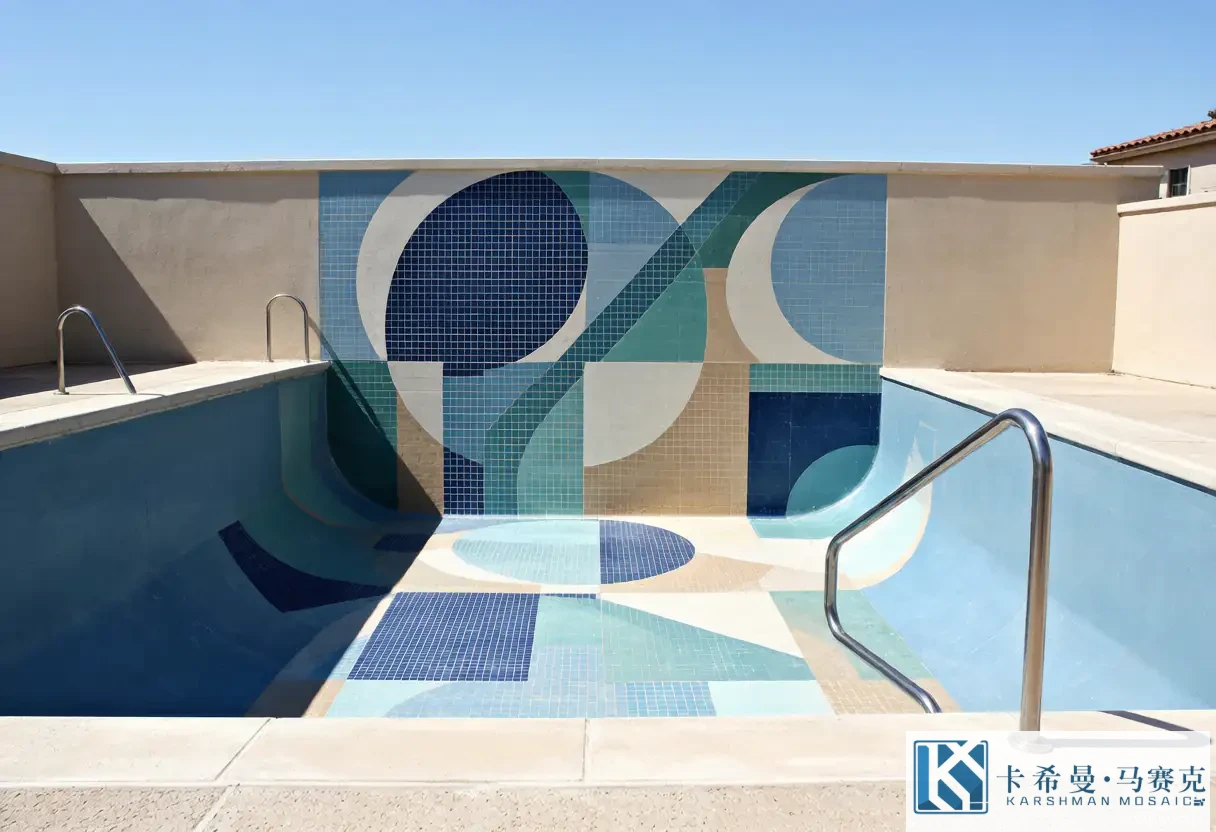
Custom abstract art is a composition drawn for your pool, your space and your taste, with no reference picture to copy. It might be a set of overlapping circles, a flowing band of tone, a geometric split of two hues, or a soft field with one bright burst. The brief is a feeling – calm, energetic, coastal – translated into form and color by the designer. Because there is no object to recognize, the work succeeds on composition: the relationship of the shapes, the spacing, the tone steps and the placement. That makes it forgiving underwater, where a literal image would need hard edges to survive, and it makes the piece flexible enough to suit modern and natural pools alike.
Starting from a concept, not a picture
The first step in an abstract commission is the concept. Instead of handing over a photo, the owner and designer agree on a mood, a palette and a style – organic flow, geometric order, or a color field with one focus. Reference images help, but as tone and feeling rather than as something to copy. The designer then drafts a composition that fits the pool shape and the viewing distance, placing the active parts where the eye will land. Starting from concept keeps the piece original and stops the work from becoming a printed copy of someone else’s picture, which is the point of a custom commission in the first place.
From concept sketch to grid
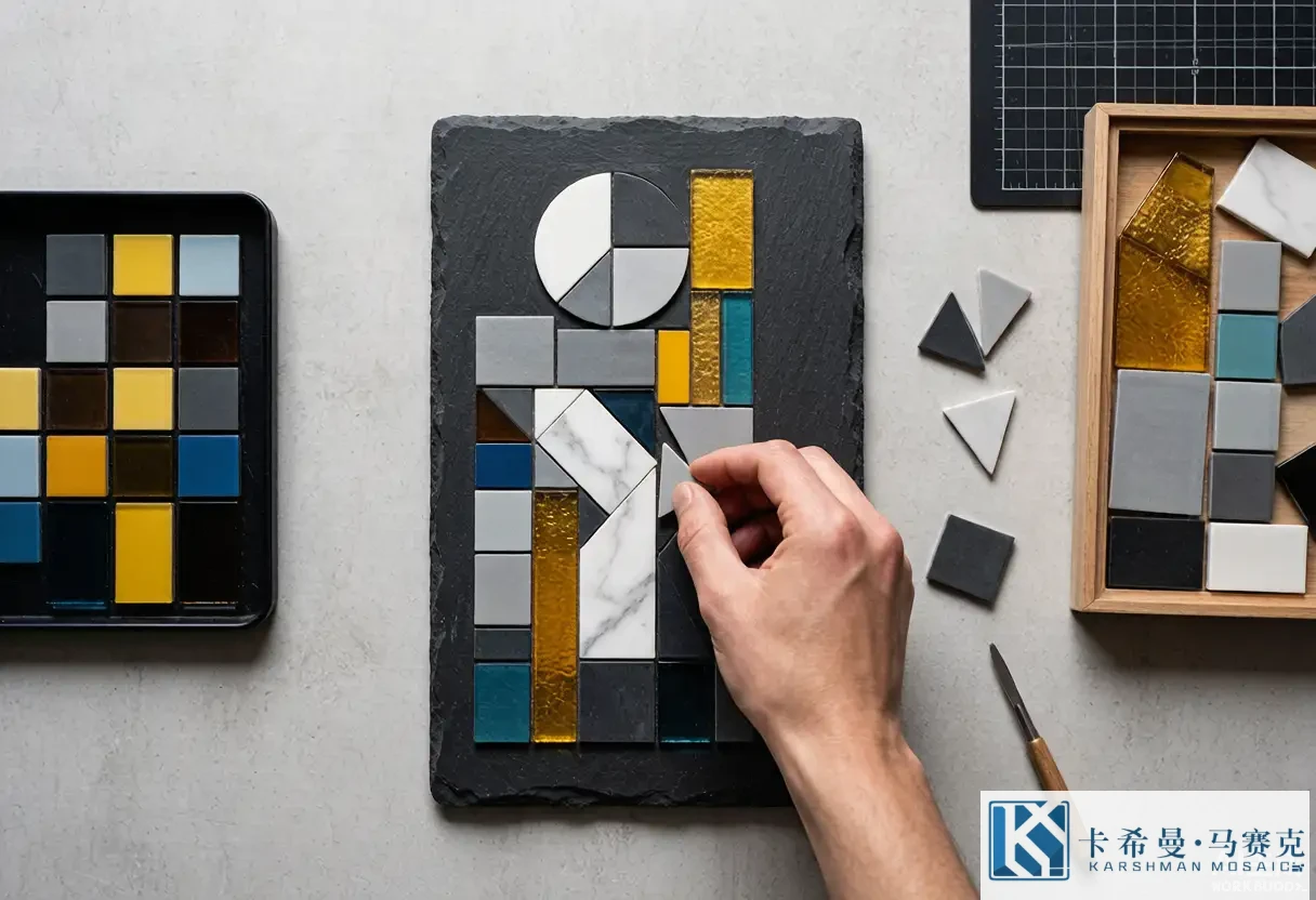
The concept becomes a grid where each cell is one tesserae. The designer simplifies the composition so the key shapes survive at tile size – a circle needs a clean edge, not an exact circumference; a band needs an even width, not a hairline. The grid sets the resolution: smaller pieces carry finer curves but cost more and take longer; larger pieces read bolder but lose finesse. A good abstract draft keeps the silhouette strong and the internal lines few, because the eye reads the outline through the water before it reads the texture. This stage is where the composition is won or lost, so the grid drawing deserves close review before any glass is cut.
Composing with form and color
An abstract pool piece is composed the way a painting is, with form and color doing the work. Form – the shapes and their placement – gives the surface structure; color gives it mood and depth. A composition might place a large soft circle off-center in a pale field, or split the panel into two tones along a diagonal, or let a band of teal flow across an aqua ground. The designer weighs the visual weight of each part so the piece feels balanced rather than scattered. Because the work sits in moving water and changing light, the composition relies on tone relationships that hold up at depth, not on a single bright color that could disappear once the pool is filled.
Balancing the composition underwater
Balance is the test of an abstract pool piece. A composition that looks right dry can tilt once submerged, because depth cools the tones and the water adds a layer that softens contrast. The designer checks the balance by squinting at the plan and by viewing a laid sample in water where possible, confirming that no single patch dominates unless that is the intent. An off-center focus can feel balanced if the surrounding field carries equal weight; a centered focus can feel static if nothing else moves the eye. Getting the balance right is what makes the piece read as considered from the deck and rewarding up close, rather than as a tile arrangement that happened to get set.
Choosing a palette for abstraction
The palette for an abstract piece stays tight on purpose. Two or three related tones read as a designed composition; five or six unrelated colors read as noise. A typical abstract pool palette might be a pale aqua ground with a deeper teal shape and a sand or white accent, or a navy field with an ice-blue band. The tones should hold their relationship at depth, so the designer picks values that contrast enough to separate the shapes but stay within one family so the blend feels calm. Because glass color is fixed in the body, the chosen tiles decide the final look, and a sample of each tone on the grid shows whether the match holds before fabrication begins.
Abstraction and tile size
Tile size shapes how an abstract composition reads. Small tesserae, around 20 millimeters or less, let a curve stay smooth and a soft edge stay soft, which is why fine abstract work uses them; larger pieces, near 48 millimeters, read bolder and suit simple blocks and bands where the picture is broad. The size also sets the grout lines, which become part of the composition, so a fine piece gains texture from its lines while a bold piece stays clean. Matching the tile size to the detail of the concept keeps the form legible rather than lost, and it avoids the cost of fine work where a bold repeat would do the same job for less on a large floor.
Finish choices for abstract art
Finish changes how an abstract piece meets the light. Glossy glass reflects sun and adds sparkle, which can enrich a feature but may glare in direct sun on a large field. Matte glass keeps the tone even and soft, a calm choice for a broad composition. Iridescent glass shifts color with the angle, adding life to a flowing band or a focal burst without a literal image. For an abstract pool piece, the finish is a color decision as much as a shine decision, so it belongs in the plan alongside the tones. A sample of each finish on the grid settles the choice, because the same tone can read quite different in gloss versus matte once the water is in.
Drafting and layout drawing
Before any glass is cut, the designer produces a layout drawing at the pool scale. The drawing shows where the art sits, how it centers or offsets, and how it meets the border and the field. For a floor piece, the drawing confirms the composition is placed where swimmers and viewers will see it; for a wall, it confirms the height and the sightline. The drawing also notes the tile size and the color key. Reviewing this at full scale, printed if possible, catches placement errors that a small screen hides, and it lets you move the piece before fabrication rather than after the panel is built and fixed underwater.
Proof and approval
The proof is the point to approve. Many studios supply a small rendered proof or a laid mini-panel of the composition before cutting the full piece. Check that the shapes read clearly, the tones relate as planned, and the balance holds on a dark or light ground. For an abstract piece, confirm the spacing feels intentional and the focus lands where you expect. Approve in writing, because the proof is the reference if the installed piece draws a question later. A careful sign-off here is far cheaper than re-cutting a mural after it is fixed underwater, so it is worth the time before fabrication begins and the glass is committed.
Fabrication of an abstract panel
With approval, the piece is built. Each tesserae is selected to the grid and fixed to a backing sheet in the right color, row by row, until the composition appears. Hand setting lets the maker follow curves a machine grid would blunt, which is why soft abstract shapes look right. The backing – mesh or paper – holds the panel so the installer sets a section at a time. Good fabrication keeps the grout gaps even and the colors true to the proof; a panel that drifts from the approved sample is the risk a written sign-off protects against, so the studio should match the proof closely and show the build against the agreed grid.
Installation of a custom abstract feature
Install follows the plan. The installer sets the art panel within the field, positions it per the drawing, and beds it in adhesive rated for submersion. Movement joints and the waterline are handled so the piece sits flush with the surrounding tile. Because the art is often the visual center, the setting has to be true – a tilted panel or a shifted composition shows at once. A tiler who has set custom mosaic before will protect the alignment and the backing; asking for that experience is a reasonable step that keeps the finished picture as drawn rather than a near version of it, and it protects the balance you approved at the proof stage.
Cost factors
Custom abstract art costs more than a stock medallion because of the drafting, the proof and the hand work. The drivers are size, tile count, the number of colors and the fineness of the detail. A small two-tone burst costs far less than a floor-to-wall composition in many colors. Mixing a custom abstract feature with a standard field and border keeps the spend focused on the focal point rather than the whole pool. Setting a budget by the art alone, and letting the field stay simple, is a practical way to get an original piece without spreading the cost across every surface, and it keeps the abstract moment as the star of the scheme.
Working with a mosaic studio
A good studio guides the brief. Bring a clear mood – calm, modern, playful – and say where the art will sit and how large it should read. Share references for tone and style rather than a picture to copy, and name what you want to avoid. Ask for the grid draft, the color key and a proof before cutting. Confirm the install method and who sets the panel. Keep the brief tight: concept, palette, placement, size. With those four points and a written proof, the studio can deliver a composition that matches the feeling and reads through the water, turning an original idea into a permanent part of the pool.
Caring for custom abstract art
Once filled, a custom abstract piece needs little care beyond the pool routine. Balanced water protects the glass and the grout; prompt removal of leaves or debris keeps the surface clear; a soft brush on the art avoids scratching a glossy face. Because the piece is fixed, there is no moveable part to maintain – the work is mostly about water quality and gentle cleaning. A short care note from the supplier, followed through the season, keeps the colors bright and the composition sharp for years, which is the quiet payoff of a panel built to sit in the water and express a feeling rather than depict an object.
Custom abstract mosaic art gives a pool an original composition built from form and color instead of a photo or logo, and it reads clearly underwater where fine detail tends to blur. If you want an original abstract piece made for your pool, contact our team for a concept draft and a laid proof.