
Abstract color-field and gradient mosaic pools treat the entire swimming pool surface as one continuous wash of tone rather than as a set of separate patterns. A gradient pool fades from one color to another – often from deep navy at the bottom to pale aqua near the top – so the water reads as a smooth, designed transition instead of a flat blue box. The look is modern, calm and surprisingly timeless, and it performs well underwater because there is no fine detail to lose. This guide explains how a gradient or color-field pool is planned, how many tones to use, how direction and depth shape the final read, and how to sample the blend before committing to a volume order.

What a color-field pool is
A color-field pool is one where a broad area reads as a single tone or a gentle step between two tones, with little or no literal pattern. The field carries the design, so the surfaces the eye sees most – the floor and the lower walls – are the canvas. A pure color-field pool might be one even aqua; a gradient pool is a color field that changes across its area. The appeal is restraint: the pool feels composed without busy motif, and it sits quietly against modern architecture where a patterned scheme would compete. Because the whole read depends on the relationship between tones, getting those tones right is the core of the work.
Gradient from shallow to deep
The classic pool gradient runs from pale at the shallow end to deep at the deep end. The transition guides the eye down the pool and makes the depth feel designed rather than accidental. A shallow-to-deep blend also reads natural, because real water does the same thing – it darkens as it gets deeper. The shift can be subtle, a half-step between two close aquas, or clear, a move from ice blue to navy. The choice sets the mood: a soft blend feels airy and tropical, a strong blend feels rich and lagoon-like. Either way the gradient gives the pool a direction the eye follows without a single depicted object.
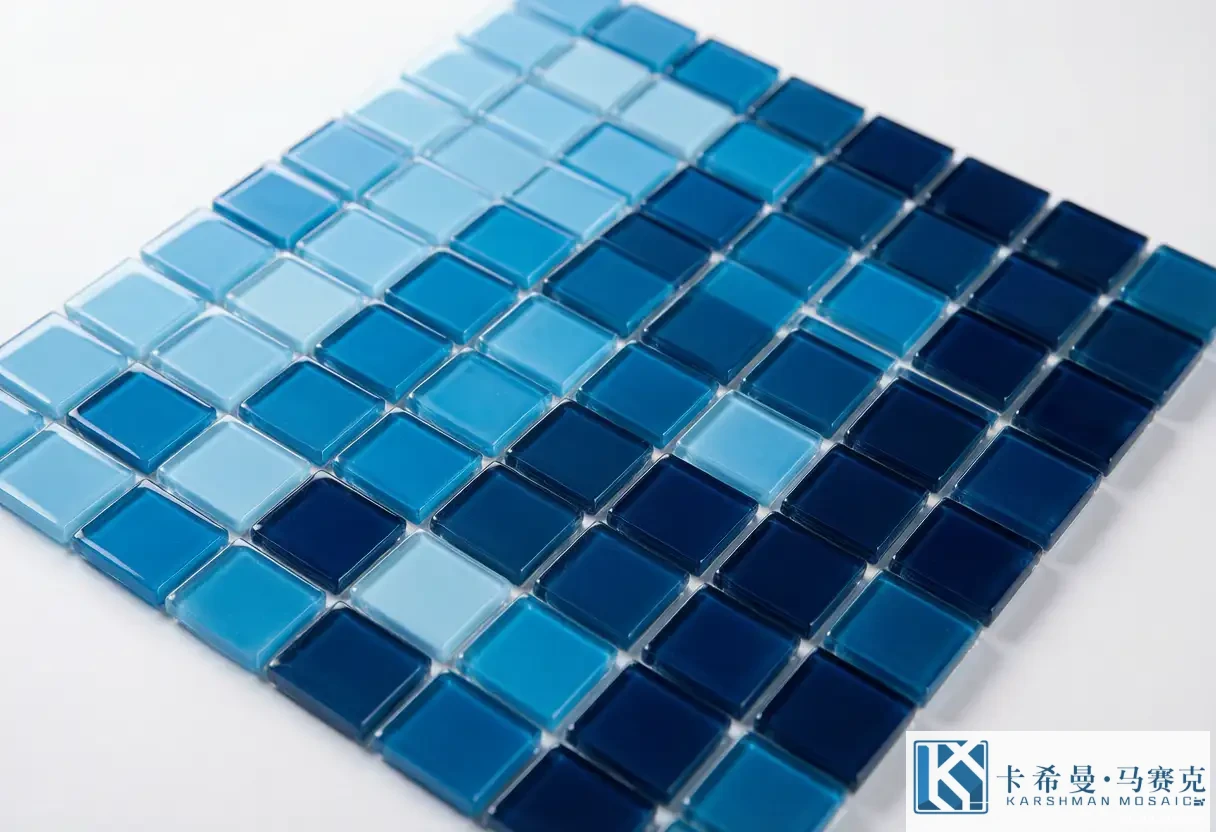
Ombre and tonal blending
Ombre is the smooth, even version of a gradient, where the tone steps by a small amount across many rows so the change is barely visible row to row but clear across the pool. Achieving a clean ombre depends on the number of tones and the evenness of the steps. Too few tones and the blend shows bands; too many and the order gets hard to keep straight during install. A typical ombre uses four to six tones stepped by a similar amount, so the eye reads a continuous wash. The grout color matters here, because a grout close to the tile keeps the steps soft, while a contrasting grout can break the blend into a stripe.
Choosing the tone sequence
The tone sequence is the order of colors across the gradient. A safe sequence stays within one family – aquas to blues, or blues to teals – so the blend does not cross into a clashing hue. The sequence should also respect the light: a pool in full sun can take a deeper start because the sun lifts it, while a shaded pool reads better from a lighter base. Writing the sequence down as a numbered list of tile codes removes guesswork on site, where a mislaid sheet can flip the order. The sequence is the recipe for the whole surface, so it deserves the same care a chef gives a formula that has to repeat across a large area.
How many tones to use
The number of tones sets how smooth the blend looks. Two tones give a clear, graphic step that reads modern but shows the seam. Three to four tones give a gentle, believable gradient that still reads as a deliberate blend. Five to six tones approach a true ombre where the steps almost disappear. More than that rarely helps and raises the risk of a wrong sheet during install. A practical plan is three to five tones for a home pool and up to six for a large commercial floor where the distance softens the steps anyway. The right count is the smallest number that still reads smooth from the deck.
Blending direction
Direction is how the gradient moves across the pool. A vertical gradient shifts with depth, shallow to deep, which is the common choice. A horizontal gradient shifts side to side, useful for a long pool viewed from one terrace. A radial gradient darkens from the edge to a light center, or the reverse, which can make a small pool feel open. The direction should match how people view the pool: a gradient that runs the way the eye already travels reads as natural, while one that fights the sightline can feel odd. Picking the direction early keeps the tone sequence and the install plan aligned.
Reading depth through color
Color changes how deep the pool looks. A pale field makes the water read lighter and the pool feel airy and shallow; a deep field makes it read darker and cooler, and can make a small pool feel larger. A gradient that deepens toward the far end pulls the eye outward and adds a sense of space. Because submersion cools a tone, the planned colors will read a step deeper once filled, so the sequence should allow for that shift. The aim is a floor that stays visible at the deep end and a scheme that reads as intended from the deck, not a color that looked right dry and vanished under water.
Matching gradient to pool shape
The pool shape guides the gradient direction. A rectangular pool with a clear shallow and deep end suits a straight vertical gradient that follows the floor slope. A round or oval pool can take a radial blend that opens from the center. A freeform pool works with a gradient that follows the longest sightline or the main depth change. Matching the blend to the shape avoids the awkward moment where a straight gradient meets a curved wall and the steps go crooked. The installer reads the direction from the layout drawing, so the shape decision has to be on that drawing before the first sheet is set.
The waterline and the gradient
The waterline is where a gradient pool needs care. If the blend runs vertically, the tone at the waterline should sit well against the coping and the dry tile above it, because that seam is the edge swimmers look at most in the pool. A common approach is to let the waterline fall on a mid tone so neither the light top nor the dark bottom meets the coping awkwardly. A contrasting border can also frame the gradient and hide the waterline seam, which is a clean way to keep an ombre pool from looking unfinished at the edge. Deciding the waterline tone before ordering prevents a blend that clashes with the pool’s edge.
Finish and light on a gradient
Finish changes how a gradient reads. Glossy glass reflects sun and can brighten a shaded gradient but may glare in direct light, which can break the smooth wash into sparkle. Matte glass keeps the tone even and soft, which suits a gradient because it hides the step changes better than a reflective face. An iridescent accent used sparingly can add life without disturbing the blend. For a color-field pool the even read matters more than the shine, so a matte or a calm gloss is often the safer pick, chosen against the actual light the pool receives rather than against a showroom sample.
Combining gradient with a patterned border
A gradient field pairs well with a simple border. Because the field is already doing the visual work, the border should frame rather than fight – a single contrasting line, a soft wave, or a tone a few steps off the field. The border defines the waterline and gives the eye a finished edge without adding a second pattern that competes with the blend. A popular, balanced plan is a pale-to-deep gradient field with a navy or white border at the waterline and the floor edge. The contrast lands on the frame, the blend stays the star, and the pool reads composed from a distance and smooth up close.
Abstract bands and color stripes
Beyond a smooth ombre, an abstract color-field pool can use bands – clear stripes of tone that step across the surface. Bands read graphic and modern, and they suit geometric or minimal pools. The bands can be even for calm or varied in width for rhythm. The risk is that hard bands can read as a mistake rather than a choice if the tones are too close, so the step between bands needs to be visible enough to read as intention. Used with restraint – a few bands rather than many – they give a gradient pool a designed structure that a pure ombre lacks, without returning to a literal pattern.
Avoiding muddiness in the blend
A gradient can go wrong by turning muddy, usually from too many tones that drift across the family or from a grout that fights the tile. Keeping the sequence inside one hue family prevents the blend from going grey or brown at the mid steps. Matching the grout to the mid tone keeps the seams soft. Viewing a laid sample in water catches muddiness that a dry board hides, because depth cools the mid tones and can pull them together. The safe habit is to test the exact sequence and grout on a panel before the volume order, so a blend that reads clean dry does not turn flat once the pool is full.
Installation notes for gradients
Installing a gradient is mostly about order. The sheets are laid in the tone sequence, row by row, following the direction on the drawing, so the blend steps the right way. The installer marks the start tone and checks it against the sequence at each row to avoid a flipped sheet that breaks the wash. Movement joints and the waterline are handled so the blend stays continuous across them. Because the whole effect depends on the steps being even, a tiler who has set gradient work before will protect the order and the alignment; asking for that experience is a reasonable step that keeps the finished blend as smooth as the sample.
Care of a color-field pool
A gradient or color-field pool needs no special care beyond the pool routine. Balanced water protects the glass and the grout so the tones stay true; prompt removal of leaves or debris keeps the surface clear; a soft brush avoids scratching a glossy face. Because the design is fixed in the tile body, there is no pattern to realign and no feature to treat differently. A short care note from the supplier, followed through the season, keeps the blend bright and the steps soft for years, which is the quiet payoff of a surface built to sit in the water without fine detail to maintain.
Planning and sampling a gradient
A gradient plan is short but exact. Write the tone sequence as a numbered list of tile codes. Pick the direction and the start tone against your light. Choose a grout near the mid tone. Approve a laid sample of several rows with the planned grout, viewed in water or under the pool light, and check that the steps read smooth and the blend holds at depth. This sign-off is the cheapest point to adjust a tone or fix a muddy mid step, and it gives both sides a reference if a question arises during the install. Treating the sample as the contract settles most disputes before the tile reaches the site.
Abstract color-field and gradient pools turn the whole surface into a smooth tonal blend that reads calm, modern and timeless underwater. If you want to plan a gradient field, border and tone sequence for your pool, contact our team for a layout drawing and a laid sample.