
Abstract pool mosaic design builds a swimming pool surface from color, form and rhythm rather than from recognizable pictures. Instead of a dolphin, a starfish or a logo, an abstract scheme uses fields of tone, soft curves, geometric blocks and repeats to give the water a character of its own. The approach suits modern homes, resorts and any pool where the owner wants a calm, composed look that does not date. Because abstraction has no literal subject, it also reads clearly underwater, where fine detail tends to blur. This guide explains what makes a design abstract and the principles that keep an abstract pool surface looking intentional from every angle.
What makes a pool mosaic abstract
A mosaic is abstract when its meaning comes from color and composition rather than from a depicted object. A school of fish is representational; a band of shifting blue tones that suggests motion without showing a fish is abstract. The difference matters underwater, because a literal image needs contrast and sharp edges to survive the play of light, while an abstract field asks only that the tones relate to one another. Abstraction also ages well, since a color composition does not fall out of fashion the way a trendy cartoon motif might. For owners who want the pool to feel designed rather than decorated, abstraction is a sound place to start.
Why choose abstract over representational
Representational mosaic has charm, but it carries risk. A creature that reads well on a dry board can lose its shape once submerged, and a logo that looks crisp in a drawing can soften at pool depth. Abstract work sidesteps that problem by leaning on tone and proportion, which hold up under water and light. Abstraction also gives the designer more freedom: instead of matching a reference photo, the scheme can be built to the pool shape, the room light and the owner’s taste. The result is often calmer and more flexible, and it pairs easily with plain architecture where a busy picture would compete with the space.
The building blocks of an abstract scheme
Every abstract pool design rests on a few elements. Color sets the mood and the depth read. Line – straight, curved or broken – gives the surface direction. Shape, from soft blobs to hard squares, gives it structure. Texture and finish add a layer that changes with the light. Rhythm, the repeat or variation of these elements, gives the eye a path to follow. A strong abstract scheme balances these blocks so the surface feels composed rather than random. The designer’s job is to decide which block leads and which supports, then repeat the decision across the whole pool so the parts read as one plan.
Color fields and blocks
The color field is the simplest abstract device: a broad area of one tone, or a few tones placed in clear blocks. A pool floor in a single aqua with a deeper block toward the deep end is already an abstract composition. Blocks can be hard-edged for a modern, architectural feel or soft-edged for a more organic read. The trick is to limit the number of tones so the blocks stay distinct; three related blues read as a designed gradient, while six unrelated colors read as noise. Used as the field, color blocks form a quiet base that lets a border or a feature carry the interest without the whole floor competing for attention.
Organic flow and curves
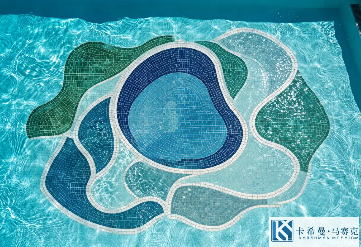
Organic abstraction trades straight lines for curves and soft transitions. A flowing band that sweeps across the floor, a pool of tone that spreads from the deep end, or a set of overlapping circles all fall into this style. Curves suit freeform and natural pools, and they read gentle and resort-like. Because the small tesserae follow the curve sheet by sheet, an organic design needs careful planning so the line stays smooth rather than stair-stepping at the edges. The reward is a surface that feels hand-made and alive, with motion built into the layout rather than printed on a single motif.
Geometric abstraction
Geometric abstraction is the opposite pole: squares, triangles, stripes and grids arranged for contrast and order. A field of offset squares, a diagonal split of two tones, or a repeated chevron in two blues are all geometric abstractions. This style reads modern, crisp and architectural, and it pairs well with rectangular pools and minimal homes. The discipline is in the spacing – even gaps and aligned edges are what make the geometry feel deliberate. Geometric abstraction also scales predictably, because a repeat that works on a sample board works on the full floor once the grid is set.
Balance and composition
Balance is what separates a composed abstract pool from a scattered one. Balance does not mean symmetry; an off-center block can feel balanced if the visual weight is distributed. A large deep field on one side can be balanced by a brighter band on the other, or by a feature that anchors the eye. The designer weighs tone, size and position so no single area dominates unless that is the intent. A simple way to check is to squint at the plan: if one patch jumps out and nothing else holds it, the balance needs work. Getting the balance right is the difference between a pool that looks considered and one that looks like leftover tile.
Negative space and the background field
Negative space – the quiet area around the active parts – is as important as the shapes themselves. An abstract scheme that fills every inch tends to read busy; one that leaves a calm field around a flowing band reads confident. The background field is the negative space, and treating it as a deliberate choice rather than the leftover area is what gives abstraction its poise. A pale, even field with a single curved line through it can feel richer than a floor packed with pattern, because the eye has room to rest. Resisting the urge to fill the surface is a habit that pays off once the water is in and the light starts to move.
Rhythm and repetition
Rhythm comes from repeating or varying an element at a set interval. A stripe that repeats across the floor, a circle that grows in steps, or a tone that shifts by the same amount each row all create rhythm. Rhythm gives the surface a beat the eye can follow, which makes even a bold abstract scheme feel orderly. The variation can be subtle – a slow drift in tone – or clear – an alternating two-color band. Either way, a consistent interval is what reads as intention rather than accident. When the rhythm is broken without reason, the surface feels unfinished, so the designer keeps the repeat honest across corners and steps.
Scale of the abstraction
Scale decides how the abstraction meets the viewer. A fine, small-piece composition reads as texture close up and as a soft wash from the deck; a bold, large-block composition reads as a clear shape even from across the garden. For a large pool viewed from a distance, bigger blocks and broader flows carry the idea; for a small spa where people sit close, finer work rewards the near view. The tile size sets the limit, because a curve drawn in 50 millimeter pieces will stair-step where a 20 millimeter piece stays smooth. Matching the scale of the abstraction to the viewing distance is what keeps the design legible rather than lost in the grout.
How abstraction reads underwater
Water and light change an abstract scheme after it is built. Depth cools and darkens a tone, so a color chosen dry will read a step deeper once the pool is filled. Sun from above adds sparkle to glossy glass and can wash out a pale field; shade keeps tones soft. An abstract design plans for this by relying on relationships – a tone a few steps apart from its neighbor – rather than on a single hero color. Because there is no literal subject to lose, abstraction copes with the shift better than fine detail does, which is a quiet reason it performs so well in real pools rather than on showroom boards.
Abstract within the three-layer model
An abstract scheme still fits the field, border and feature model. The field can be an abstract color block or a soft gradient; the border can be an abstract band – a stripe, a wave line, a tonal step – rather than a rope motif; the feature can be an abstract medallion, a rosette of tone, or a flowing center rather than a creature. Treating abstraction as the style applied to the same three layers keeps the plan manageable and the budget clear. A common, safe route is an abstract field, a simple abstract border and one abstract feature, which gives the pool a point of view without covering every wall in pattern.
Mixing abstraction with a focal point
Abstraction does not rule out a focal point. A pool can run an abstract field and border while placing one stronger abstract moment – a burst of contrast, a spiral, a cluster of circles – where the eye should land. The focal point works because the surrounding calm makes it pop, the same way a single bright note reads against a quiet background. The discipline is restraint: one focus, not three, so the surface stays composed. For owners who like abstraction but still want a “there” in the pool, a single abstract feature inside an otherwise calm field is the balanced answer.
Material and finish for abstract work
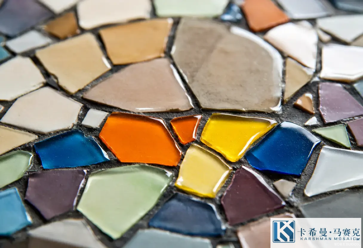
Glass is the natural choice for abstract pool mosaic because its body color stays true underwater and its range of tones supports smooth blends. Glossy glass lifts a shaded pool and adds sparkle; matte glass keeps a tone soft and hides marks in bright sun; iridescent glass shifts color with the angle, which can enrich an abstract flow or a feature. For a calm color-field pool, a uniform gloss or matte keeps the blend clean; for an abstract feature, an iridescent accent adds life without a literal image. The finish is part of the color decision, so it belongs in the plan alongside the tones rather than as an afterthought once the tile is ordered.
Trends in abstract pool design
Current abstract pool trends lean soft and coastal. Blended blue fields, gentle wave lines and overlapping circles appear often in resort and home pools, alongside darker lagoon tones framed by a light border. Iridescent accents and a single abstract feature in an otherwise plain field are also common. What stays useful is the principle, not the fashion: a clear field, a defined border and one focus read well in any year. Following a trend is fine, but building the scheme to the pool shape, the light and a restrained palette is what makes an abstract design hold up after the season’s colors fade.
Planning an abstract scheme
A practical abstract plan runs in order. Pick the mood – calm, modern, playful. Choose a style – color field, organic flow or geometric. Set the tone range and the number of colors, keeping it tight. Decide where the active parts sit and leave a calm field around them. Match the scale to the viewing distance. Choose a finish for the light. Approve a laid sample of the field and the border together, viewed in water or under the pool light, before the volume order. A list this short covers the points that decide whether the pool reads composed or busy once it is full and the surface is fixed for years.
Sample approval for abstract work
Because tone shifts underwater, a dry loose tile is not a safe reference for an abstract scheme. Lay a panel of the field and the border with the planned grout, and view it in water or under the pool light if possible. Check that the blocks stay distinct, the flow stays smooth, and the balance holds at depth. For an abstract feature, confirm the focal point lands where the eye expects. This sign-off is the cheapest point to adjust tone or layout, and it gives both sides a reference if a question arises during the install. Treating the sample as the contract settles most disputes before the tile reaches the site.
Working with a designer on abstraction
When you brief a designer on an abstract pool, bring the pool shape, the depth plan and a mood, plus references for the tone and the style you like. Say what you want to avoid – too busy, too cold, too plain – as clearly as what you want. Ask for a layout drawing and a laid sample before you commit, and review the balance by squinting at the plan. A good partner will flag a blend that will muddy at depth or a curve that will stair-step on your shape, and will show the proof before fabrication. Clear brief plus a physical sample is the combination that turns an abstract idea into a pool that looks composed from every angle.
Abstract pool mosaic design builds character from color, form and rhythm instead of pictures, and it reads clearly underwater where fine detail tends to blur. If you want to plan an abstract field, border and feature for your pool, contact our team for layout drawings and laid samples.