
Pool mosaic pattern and color planning is the stage where a pool stops being a blue box and starts having a point of view. The pattern is how the small pieces are laid – grid, brick, wave, star – and the color is how those pieces are toned, from pale aqua to deep navy. Together they set the mood, change how deep the water reads and decide whether the pool feels calm, formal or playful. This guide collects pattern families and color ways, then shows how to plan a scheme that fits your pool, your light and your taste.
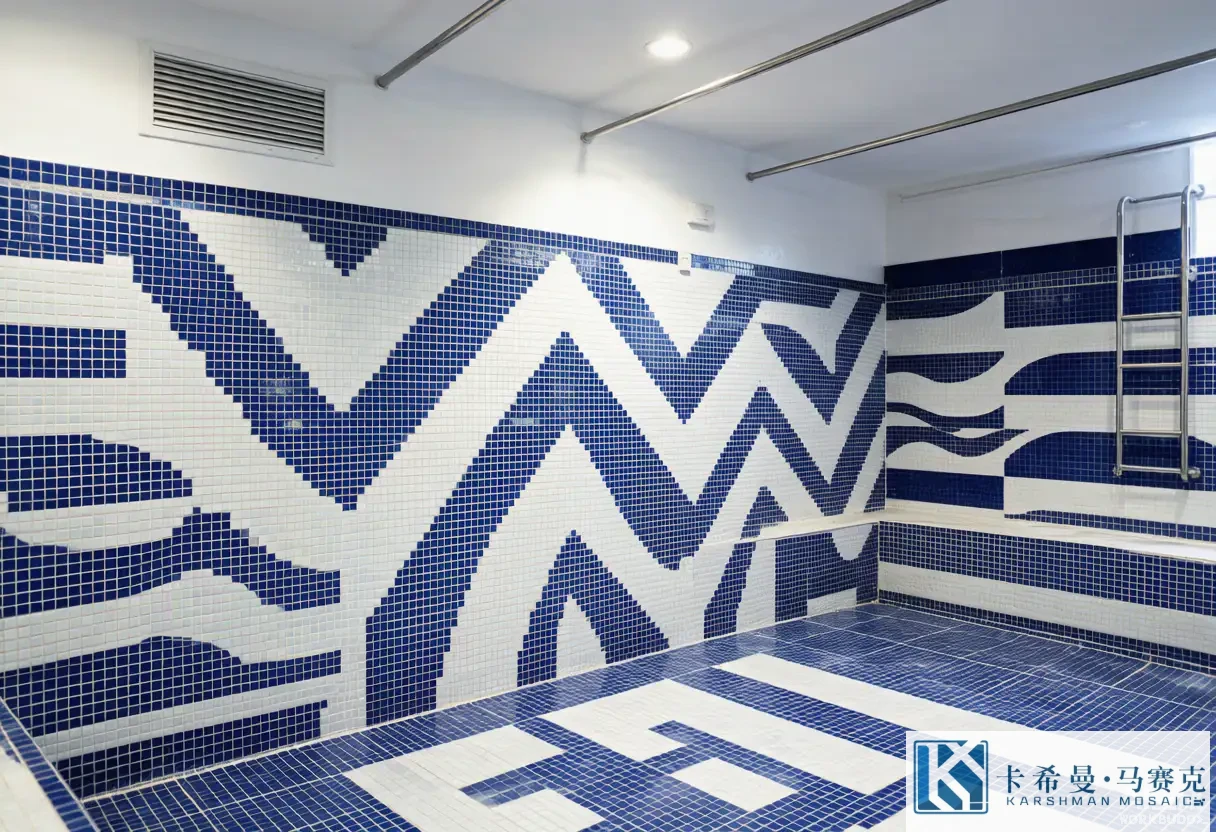
Tile shapes you can use
Pattern starts with shape. Square tesserae are the default and suit grids, bricks and most repeats. Rectangular pieces suit a brick or a herringbone run. Penny-round and oval shapes soften a wall and read organic. Elongated strips build a clear linear or wave pattern. The shape decides the grout lines, which become part of the design, so the choice is about the whole surface, not just the piece. For a custom medallion, small squares carry the detail; for a plain field, larger squares or rectangles are faster and bolder. Picking the shape first keeps every later choice consistent.
Layout grids
The grid is how the pieces line up. A straight grid is calm and ordered and suits a rectangular pool. A brick or running-bond layout shifts the seams for a softer, hand-laid read. A herringbone adds energy and direction, often down a lap pool. A diamond grid turns squares on the bias for a formal feel. A radial grid follows a round pool or a circular medallion. The grid sets the rhythm of the whole surface, so it should match the pool shape and the mood before color is even chosen – a busy grid with a busy color can read loud, while a calm grid with a calm color reads timeless.
Pattern families
Patterns group into a few families. Linear patterns – grid, brick, herringbow – suit modern, ordered pools. Geometric patterns – star, diamond, chevron – suit formal or period looks. Organic patterns – wave, pebble, free curve – suit natural or resort pools. Mixed patterns pair a plain field with a patterned border or a feature, which is the safe, popular route. Each family carries a feeling, so the brief should name the mood first, then the family, then the exact repeat. A wave border with a plain field, for example, reads coastal without covering the pool in pattern.
Color families for pools
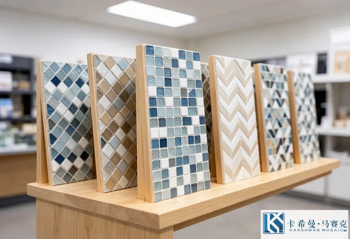
Pool color lives in a narrow, watery range, and that is its strength. Pale aqua and sky blue read bright and tropical. Mid blue reads classic and clean. Deep navy and teal read rich and resort-like. White and ice tones read crisp and modern. A mixed blue field with two or three close tones adds life without leaving the family. The safe plan is to stay within one family for the field and spend contrast on the border and the feature. A pool that holds one color family reads composed; one that mixes families across the floor can read patchy once the water moves over it.
Using color to shift depth
Color changes how deep the pool looks. A pale field makes shallow water read lighter and the whole pool feel airy; a deep field makes the water read darker and the pool feel larger and cooler. A gradient – pale at the shallow end, deep at the deep end – guides the eye and adds a designed transition. Because depth cools a tone, a color chosen dry will read a step darker once filled, so the plan should allow for that shift. The trick is to pick values that hold their place at the actual depth, so the floor stays visible and the scheme reads as intended from the deck.
Combining pattern and color
Pattern and color should support, not compete. A strong pattern asks for a quiet color so the geometry shows; a strong color asks for a simple pattern so the tone reads. A common, balanced plan is a plain or two-tone field, a patterned border and a featured medallion in a contrasting tone. That way the eye has a clear path: field, then frame, then focal point. A pool with pattern and color fighting across every surface tends to read busy rather than rich, so restraint in one of the two is the habit that keeps the scheme composed from a distance and detailed up close.
Scale and the gaze
Scale sets how the pattern meets the eye. Fine pieces and tight repeats suit a feature or a medallion where detail matters, and they read rich close up. Large pieces and broad repeats suit a field where the picture is big and the viewer stands back. For a long pool wall, a broad wave reads from across the garden; for a small spa floor, a fine star reads in the hand. Matching the scale to the viewing distance keeps the pattern legible rather than lost, and it avoids the cost of fine work where a bold repeat would do the same job for less.
Light and the finish
Light and finish change the color after build. Glossy glass reflects sun and adds sparkle, which brightens a shaded pool but can glare in direct sun. Matte glass keeps the tone soft and hides marks, good for a bright, open pool. Iridescent glass shifts color with the angle, adding life to a creature or a feature. A pool in full sun may suit a calmer finish; a pool in shade may suit a glossy one to lift the light. The finish is a color decision as much as a shine decision, so it belongs in the plan alongside the tone rather than as an afterthought.
Mixing with a plain field
The plain field is the quiet hero of most schemes. A single tone or a two-tone field lets a patterned border and a medallion do the talking, which keeps the pool calm and the cost fair. The field can be a soft aqua with a navy border, or a white field with a teal wave – either way the contrast lands on the frame and the feature. For a first pool or a resale property, a plain field with one patterned element is the lower-risk choice that still reads designed. As confidence grows, more pattern can enter, but the field first is the sound base.
Trend notes
Current pool mosaic trends lean natural and coastal. Wave and pebble patterns, blended blue fields and iridescent accents appear often in resort and home pools. Dark, deep fields for a lagoon look are also common, paired with a light border to frame. Monogram and logo murals show up in clubs and hotels. What stays constant is the value of a clear field, a defined border and one feature – trends come and go, but a composed scheme reads well in any year. Following a trend is fine; following the shape and the light of your own pool is what makes it work.
Planning checklist
A short checklist keeps the plan on track. Name the mood – calm, formal, playful. Pick a tile shape that fits the pattern. Choose a grid or repeat that matches the pool shape. Stay in one color family for the field, and spend contrast on the border and the feature. Match the scale to the viewing distance, and pick a finish for your light. Approve a laid sample under water before the volume order. A list this short covers the points that decide whether the pool reads composed or busy once it is full.
Sampling before you commit
Because water and light change the read, a dry loose tile is not a safe reference. Lay a sample board of the field, the border and the feature together, with the planned grout, and view it in water or under the pool light if you can. Check that the pattern reads at distance, the color holds its depth, and the border frames without dominating. This sign-off is the cheapest point to adjust tone or layout, and it gives both sides a reference if a question arises during the install. Treating the sample as the contract settles most disputes before the tile reaches the site.
Two-tone versus a blended field
A field can be two-tone or blended. A two-tone field – a light and a slightly deeper shade mixed at random – adds life while staying calm, and it hides the waterline stain better than a single flat tone. A blended field uses three or more close tones for a soft, shifting surface that reads rich without a pattern. Both suit a plain field with a patterned border. The choice is mostly about how much movement you want; a two-tone reads tidy, a blend reads organic. Sampling both on the grid shows which fits the room before the volume order is placed.
Border width and contrast
Border width and contrast work together. A narrow border in a tone close to the field reads as a quiet edge; a wide border in a strong contrast reads as a clear frame. For a calm pool, keep the border modest and the contrast low; for a formal pool, widen the band and deepen the tone. The border also hides the waterline seam, so a slightly darker tone there keeps the line crisp through the season. Checking the width and the contrast on a sample, next to the field, shows whether the frame reads as intended before the tile is cut.
Pattern direction and sightlines
Pattern direction should follow the eye. A wave or chevron that runs along the pool’s long axis reads as flow; a radial pattern that meets at a medallion draws the gaze to the center. In a feature wall, a vertical brick or a stack reads calm, while a herringbone adds energy. The sightline from the main viewing spot – the lounge or the gate – decides which direction the pattern should take, because that is where the pool is seen most. Aligning the pattern with the sightline keeps the design coherent rather than fighting the way the space is actually used.
Timeless versus trend-led choices
A calm field with a defined border and one feature reads well in most years, which suits a home you may sell. Trend-led choices – a bold iridescent scene, a dark lagoon field – delight now but can tire. Expressing trend through a small, changeable accent, such as a feature wall or a spa floor, keeps the main pool flexible. A balanced plan spends the trend on the part you might redo, and keeps the large field composed. This split protects both the look today and the value later, without making the pool feel plain.
Working from a mood board
A mood board turns the brief into a reference. Collect the field tone, the border, the feature and the adjacent finishes – deck, stone, paint – on one page, then view it under the light the pool has. A board shows how the pattern and the color meet the rest of the space, details a screen hides. Building the board before the order is the cheapest point to adjust, and it gives the installer a clear target on the day. Treating the board as the plan keeps the scheme close to what you pictured when the water is in.
Pool mosaic pattern and color planning turns shape, grid, pattern family and color way into a scheme that fits your pool, your light and your taste. If you want to plan a pattern and palette for your pool, contact our team for sample boards and a layout drawing.